Indoek Venice – Lone Wolfs, Objets d’ Surf

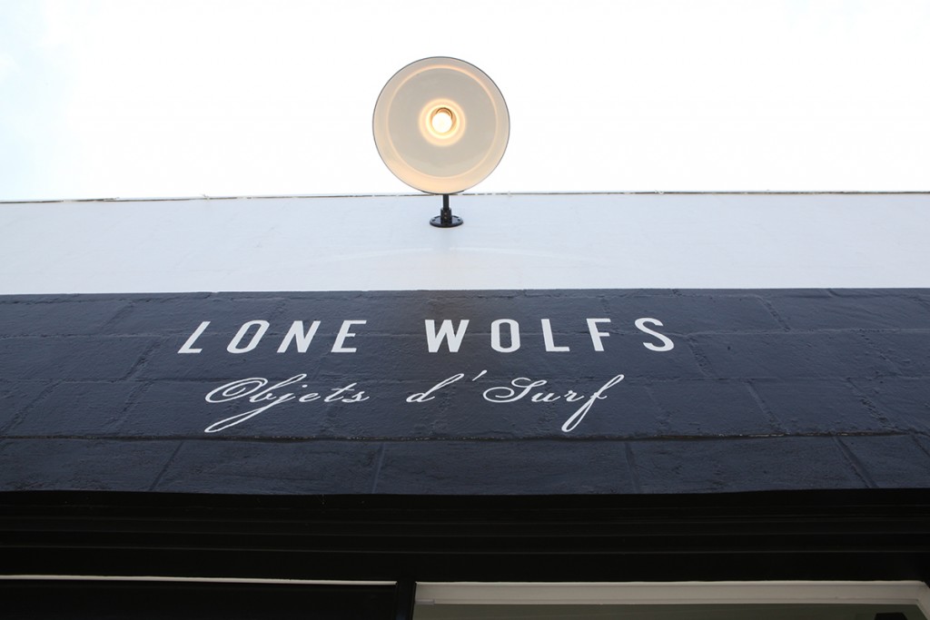
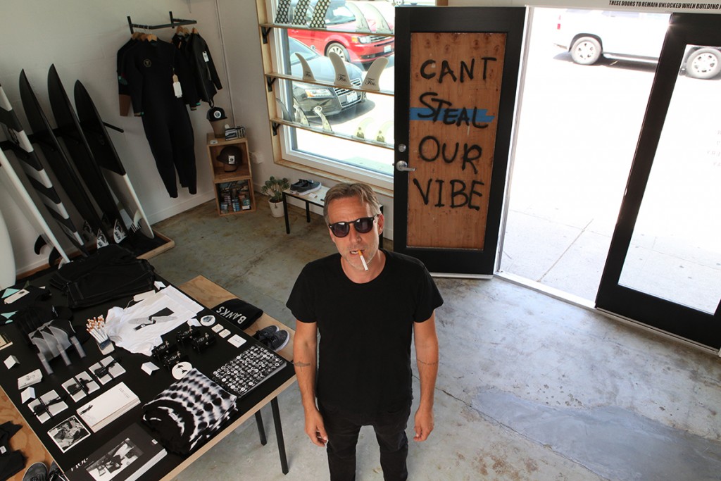
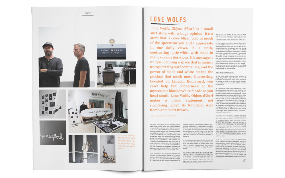

Lone Wolfs, Objets d’Surf, is a small surf store with a huge opinion. It’s a store that is color blind, void of much of the spectrum you and I appreciate in our daily views. It is stark, contrasting optic white with black in many various iterations. Its message is unique, defining a space that is mainly unexplored by surf companies, and the power of black and white makes the product that much more interesting. On a busy intersection of Venice Beach, the one you have to go through when going anywhere south, the store’s exterior is clean, sharp fonts and clean windows. Grey and white, with one plywood wooden door that is obviously a repair from someone throwing something through it. Check out their story, part of our Indoek Venice issue (also available in our shop)
Lone Wolfs, Objets d’Surf, is a small surf store with a huge opinion. It’s a store that is color blind, void of much of the spectrum you and I appreciate in our daily views. It is stark, contrasting optic white with black in many various iterations. Its message is unique, defining a space that is mainly unexplored by surf companies, and the power of black and white makes the product that much more interesting. On a busy intersection of Venice Beach, the one you have to go through when going anywhere south, the store’s exterior is clean, sharp fonts and clean windows. Grey and white, with one plywood wooden door that is obviously a repair from someone throwing something through it.
Before it opened, about 11 months ago, I was on Venice beach with my son doing a surf check of the pier, and we noticed a small crew with an opinionated longboard doing a little filming. Mostly bearded dudes, seeming strangely out of place and yet familiar, they had a humor about their task that was intriguing.
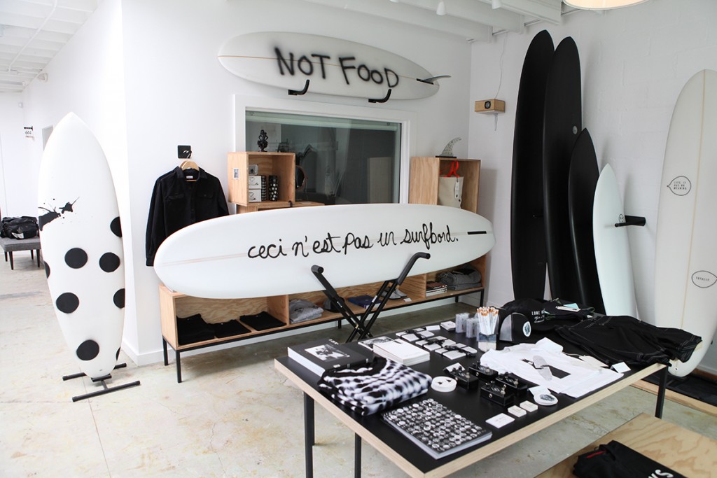
The board was simply white, sprayed with a black cursive “ceci n’est pas un surfbord”, a french term ripped off and abused from the famous Belgian surrealist René Magritte. His famous piece “the Treachery of Images” was a painting of a pipe, with the term “ceci n’est pas un pipe.” beautifully scripted on to the work. The meaning of his work was that whilst the picture depicted a pipe, it was not an actual pipe. Funny that these guys had known the term (not everyone knows the reference), and given it their own absurdist remaking.
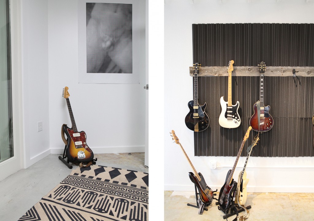
Social media travels fast. I quickly found out it was a couple of guys about to open a surf store on Lincoln Blvd, here in Venice. Then I saw pics of guitars involved in the space as well as the surf shop, and the intrigue remained.

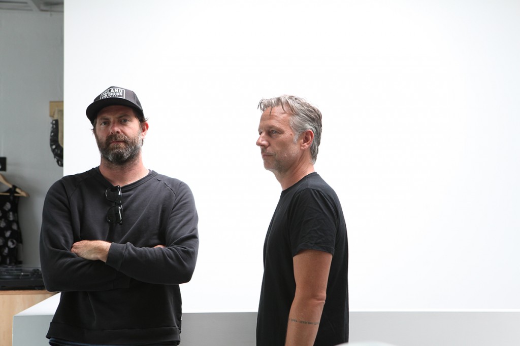
Lone Wolfs, Objets d’Surf makes a visual statement, not surprising, given the type of guys Alex Kemp and Scott Brown the founders are. Alex hails from the world of music, and the state of New York. He talks easily, spinning soundbites constantly. He’s been presenting ideas for a long time now, you can tell. He is a music maker, creative director, creating tracks for advertising and film.
Alex Kemp: After starting my own company with my studio partner Jimmy, things were going well. We wanted to build our own studio so we wouldn’t have to hire other studios all the time. I knew we could build a studio in Culver City where no one would see us, but wouldn’t it be cooler to maybe put a surf shop in front? Retail in front and studio out back, it would bring some life into the space. Jimmy was totally down with that.
I was surfing with my buddy of about 4 years, Scott Brown, a Creative Director at Chiat Day (a top global advertising agency based in Los Angeles), and discussed the idea with him, as we would talk all the time about different stuff, while changing in the carpark from a surf.
I told him how I wanted to incorporate a small surf brand (like Almond surfboards) with it at first, to do something rad, and maybe to represent some of the rad Aussie brands we love, like Misfit shapes or something. Strangely, Scott had a name that he had already been thinking about for a surf brand, that he didn’t tell me straight away.
Scott Brown: I met Alex doing a TV spot, about 4 years ago, and we’ve worked together on a couple of projects together since. Then Alex started Wolf at the Door (his music studio). At this stage I was body surfing, I had the disease, getting in the water every day, as Alex did surfing. We always met in the carpark.
Alex told me he was going to do a surf shop at the front of his new studio.
A couple of weeks go by and I told Alex I had a name for a surf company called Lone Wolfs. My concept and art direction was comical, far off from what we’re doing now. I had waited to tell him and had that name a lot before Alex was thinking of the store.
When we thought that we could create our own brand for the store the concept of the brand changed and with Alex’s studio called Wolf at the Door, the name Lone Wolfs was an obvious fit.
AK: We started mocking up stuff at night, surfboards and other visual ideas, sending them to each other, then we’d surf every morning, and talk over the ideas. Over the course of 3 months, we arrived with what we wanted, to get the voice. We had the idea that its “designy”, black and white, with a certain severity in visual aesthetic, but a really goofy spirit in its heart. Between their discussions, Alex brought a cinematic feeling to it.
Alex has worn some black every time I’ve met him. Sometimes stealing out the front to drag on a ciggie, he epitomizes a different vibe to the “now” californian vibe embracing yoga, Whole Foods and Moon Juice. He showed his NYC roots, although they’re way back there. In this land, my home too, of sunshine and nearly eternal blue skies. I wanted to know: Black in your life? Cigarettes?
AK: This is going to sound fear based, which I don’t want it to. My first instrument is bass. And when you’re playing bass The Number 1 rule is don’t fuck up. Don’t do anything brilliant, don’t be flashy and have your foot up on the monitor and get the chicks wet, it’s DON’T FUCK UP, Dude! Keep the line driving. Black is playing bass. You are laying down the groove, it is rock solid.
I grew up in NYC when it was Scorsese’s “Taxi Driver”. We smoked, we did a lot of drugs, we did not have outdoor time. We’d get mugged if we went outside. After a surf, when I’m back on the land, then I say f**k you surfing, you don’t own me, you don’t tell me to wear colors and not smoke, and I get to be me. Surfing. I love you, but I get to be me. I would say the same thing to my wife. You’re the best thing that’s ever happened to me, and also I’m going to be me.
I found out how totally diverse these two’s backgrounds were when Scott added his story to their mix:
SB: My job while I was going through college in Wyoming was coal mining. I didn’t want to do that. Shoveling all day, black lung. I got a philosophy degree in college… so… I went back and worked in mining. Then after 3 years drove to LA. Got a temp job at Chiat, at the front desk. I weaseled my way into the company. I’m an art director/creative director there. I loved cinema. Went into art direction. I’ve been at Chiat for 10 years.
Let’s be clear, as an observer, Lone Wolfs is kind of punk, kind of art, kind of tongue in cheek and definitely visually sharp. All art directed. There’s nothing unconsidered about the space or the product in it. They call Lone Wolfs cinematic, and one can see that. Arthouse, French Nouveau, and this leads to a discussion about a fin.
SB: The first thing we did was the Fin fin. It felt like something we zeroed in on, and felt like it could become something on its own. Then the graphic design became secondary, the love of cinema became the score behind the brand. Then we settled in pretty fast. Black and white is not an idea, we don’t ever want to say that. Its a juxtaposition. We were not going to veer from that, not at the start of this. It was a natural place we fell into.
Mollusk really does a great job of its branding, the font, the color, and the alternative, logs and fun surfcraft, and the artistic movement to surf. A little bohemian, the precursor to the whole retro craftsmanship movement here in LA. It’s always been an inspiration.
We took more of a cinematic view. We did zero research, and what we knew was ignored. We almost started as an outsider artist. We wanted it to be an art collective. Its like the films we make. That’s our dream.
AK: We crystallized in a physical form what it is about surfing from our urban creative lives. Cinema is a driver to the brand. The brand is a little nostalgic. We are sitting under a board from Apocalypse Now (they have an original board from the film, over the lounge area in the recording studio) That 60’s surf vibe is an amazing era, the best time of surfing.
Venice. What is it about here?
SB: This whole thing was created and produced in that parking lot (Washington Blvd Pier). In the South Corner. The other day there was a bunch of crows in the parking lot. Not to be too dark or goth, but that’s our place. There’s crows on our beach. That’s what this was born from. It gives an authenticity to this.
AK: I love Venice. I had a job in Santa Monica. I wanted to live in Venice, my buddies were all musos who lived in Silverlake, but I had started surfing. When I see all the summer all the tourists on the boardwalk, it’s kind of a destination for pople that don’t live here. In the world of surf of skate, it has the heritage of Dogtown. I grew up in NYC, its not my native language. I’m stoked it will be for my kids. Venice is changing so quickly, I know people are saying that sucks, silicon beach etc. I don’t hate gentrification, I’m a little bougey sometimes too.
All the early adopters have been coming in, they are making shitloads for a living. It does feel like people are throwing down here though, I started this, or I’m doing this. A lot of vibrancy, action, people taking action.
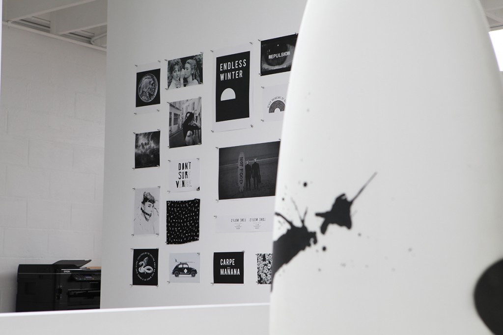
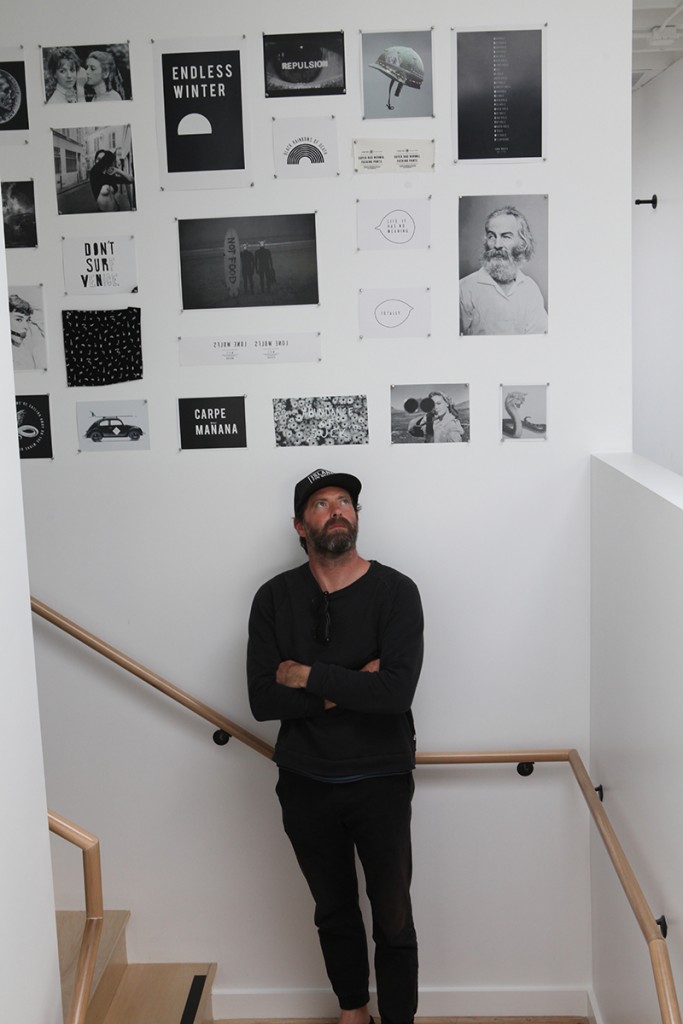
Whilst they talk of nostalgia, everything about this store reeks a modern, cultured sensibility. The boards are ALL black and white, or black OR white. Not necessarily practical for wax in California sun, but beautiful in the context of a boutique, or an opinion. Its a very clear edit, pared down. A salon wall of pictures, of art and actual ics, all black and white. Boards with punk spray painted polka dots, art reference quotes mashed up, and goofball-ness.
AK: We have some humor in the store, the “not food” board, is funny, its obviously for sharks. Whilst our boards are great shapes, that board had to be there (on the wall), it breaks it all down. Elegant sophisticated visuals, and yet we’re goofballs. That’s something Scott and I came to without ever verbalising. We describe Lone Wolfs as being “post bro”. We’re not about the Spiccoli heritage of surfing. Not because we don’t like it and think it’s rad, it’s just not who we are.
We found a way to bring out who we are, and still love surfing, yet give our voice some visual representation. We take a lot of pride in the boards, the way we came to the shapes and functionality of the boards. Aaron, who is the Maitre de surf, a shredding surfer. He manages the more technical details. We develop together what boards we want, and then talk with the shaper about the volume and rails. Inspirational to us is the new approaches shapers are making, wider/fatter, more eggy. The board has to turn, but that doesn’t mean I want to go on the (WSL) tour next week.
Each surfboard has its own fins. The artwork on the fins is all designed by us. We are visually driven. making a surfboard look right it had to have a certain fin design to go with it, aesthetically. The way any board leaves the shop is the way we want them to look.
Your tagline is Lone Wolfs. Ride Alone, Together.
AK: It came as an “aha” tag line to Lone Wolfs. It’s a very singular creature, that became plural, and then we spelt it wrong to point out that were making it plural. It also relates to what its like to go surfing with your friends. You can all meet at the parking lot and then go out and not talk.
The store has some funny video shorts on its site. They speak of having/being an Art Collective, whereby their friends collaborate with them, and they make films.
SB: More films. Films are just creative output. Writing dialogue is amazing. Its also great to have people respond well to it. Someone liking it. We’re not too punky to say we don’t care, we want people to like our stuff.
AK: Scott writes and art directs spots. It’s a collective now, with all of our friends. Three of us wrote scripts. The 3 scripts, all got together one morning and filmed them .We are going to do another round of shorts, with women next time. Women surfers matter to us. With Patrick Wilkins and Adam Sinclair, we’ll write another longer piece. So far the only unwritten rule is no surfing in our surf films (yet).
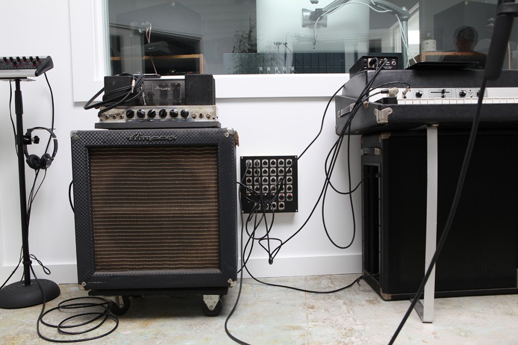
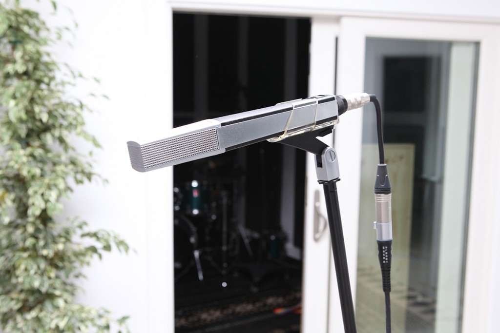
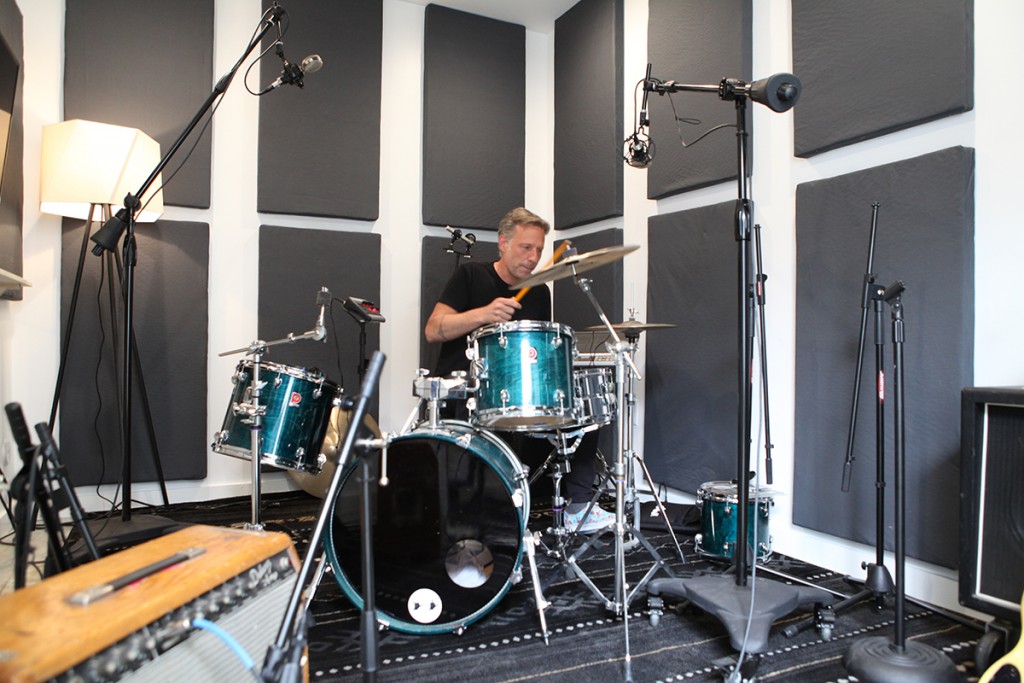
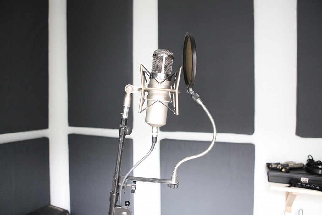
The other thing about this store that draws people in who are hearing about it, is the recording studio in the back. It’s not behind locked doors, Alex, Aaron and Courtney always seem welcoming to people who want to see the studio, there’s guitars, amazing vintage mics and amps, and a drum room, that have stories already of dueling kids on drums, older, celeb drummers, and drummers who forgot their past coming out of that room with tears in their eyes. It’s a totally legit facet of this place, one that makes a further look necessary. Its a place that invites, as music is so egalitarian, we all love it.
If you’re driving south on Lincoln Blvd, look opposite the AT&T store, just before Washington Blvd, on a part of the road that is most definitely not yet cool… Look past the monochrome grey/white exterior. Inside, beyond the very white, architecturally faceted walls, the almost scandinavian pale wood and powder coated black fixtures (just ply actually). Past thewindow of unique art fins they create, past the kids tees with the TURD graphic, past the Banks (their good friends Brad and Jonas) and Vissla product, past the wetsuits by ’81, the Vampirate boards by Ozzie Wright and Salt surfboards, past the handpainted Vans, the best collection of modern, artistic surf magazines, and you might see Alex at his mixing desk, with a band in the studio. Then again, you might see five people huddled around, beers in hand, laughing at a new script they’ve just come up with for a short video about a girl in a polka dot bikini, a black lifeguard tower, crows all around, on a white beach with no surf.
Check them out at 2545 Lincoln Blvd, Venice CA, 90291. And online:
Lone Wolfs
This article originally appeared in our Indoek Venice issue, an 84 page, large format newsprint publication focused on the characters, history and places that make Venice so unique. Get your copy here while they last:
Indoek Venice
Photography & Interview by Mark Wiesmayr
Related Stories

Order our “On Surfing” book today.
Buy Now